Far Out Clothing Case Study
Project Overview
The "Far Out" landing page is a conceptual project aimed at showcasing a surf clothing brand through a vibrant and storytelling-driven design. The project blends bold visuals with a carefree, adventurous vibe, aligning perfectly with the surf culture and lifestyle.
Project Goals
Create a strong brand identity: Establish "Far Out" as a surf brand that embraces freedom, adventure, and youthful energy.
Engage the target audience: Capture the attention of surfers, beachgoers, and lifestyle enthusiasts.
Emphasize storytelling: Utilize visuals and typography to evoke a sense of nostalgia and excitement.
Engage the target audience: Capture the attention of surfers, beachgoers, and lifestyle enthusiasts.
Emphasize storytelling: Utilize visuals and typography to evoke a sense of nostalgia and excitement.
Design Approach
Visual Style
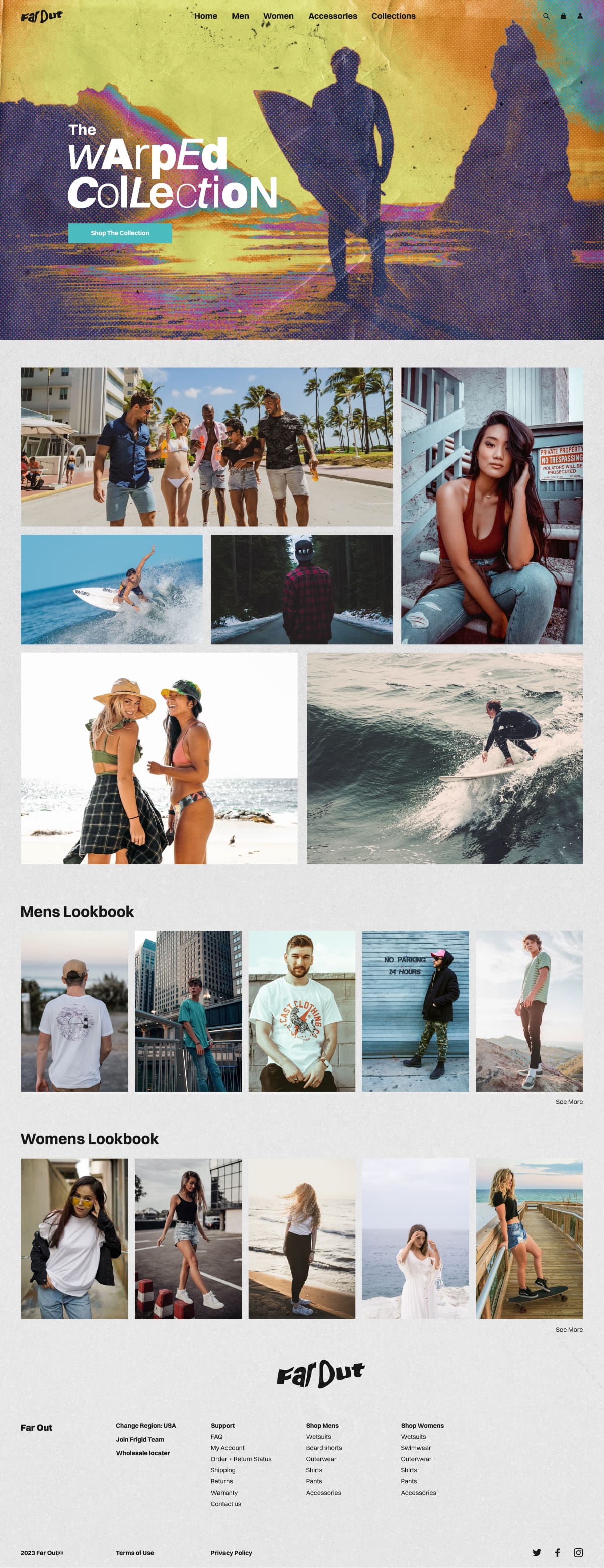
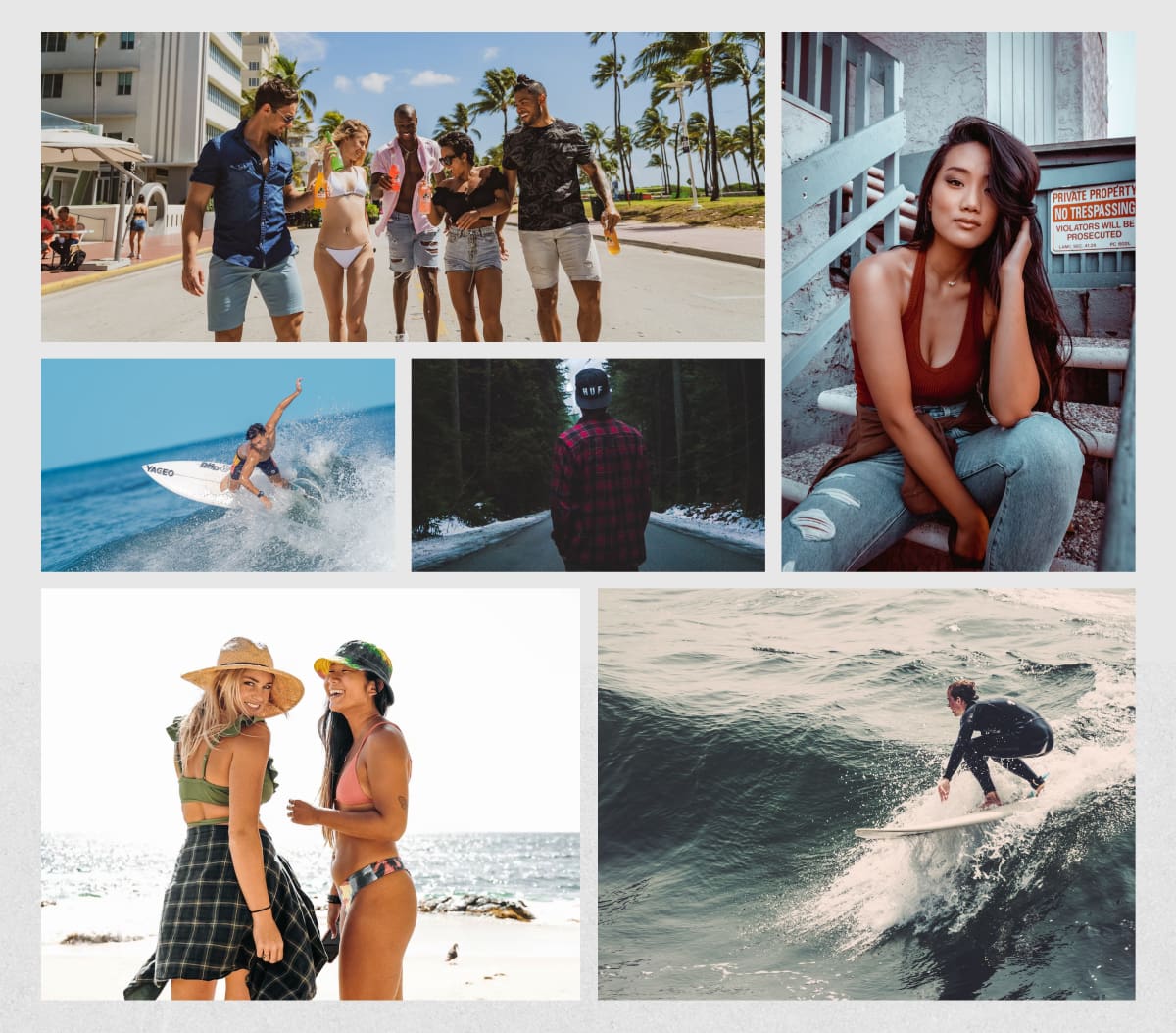
The landing page features a gritty, retro-inspired hero section with a mix of bold colors, textured overlays, and dynamic typography. The header image of silhouetted surfers against a psychedelic background sets the tone for the "Warped Collection."
Typography
The playful and varied typography in the hero section adds to the brand’s quirky and rebellious persona. It emphasizes key messaging while keeping the design fresh and engaging.
Imagery
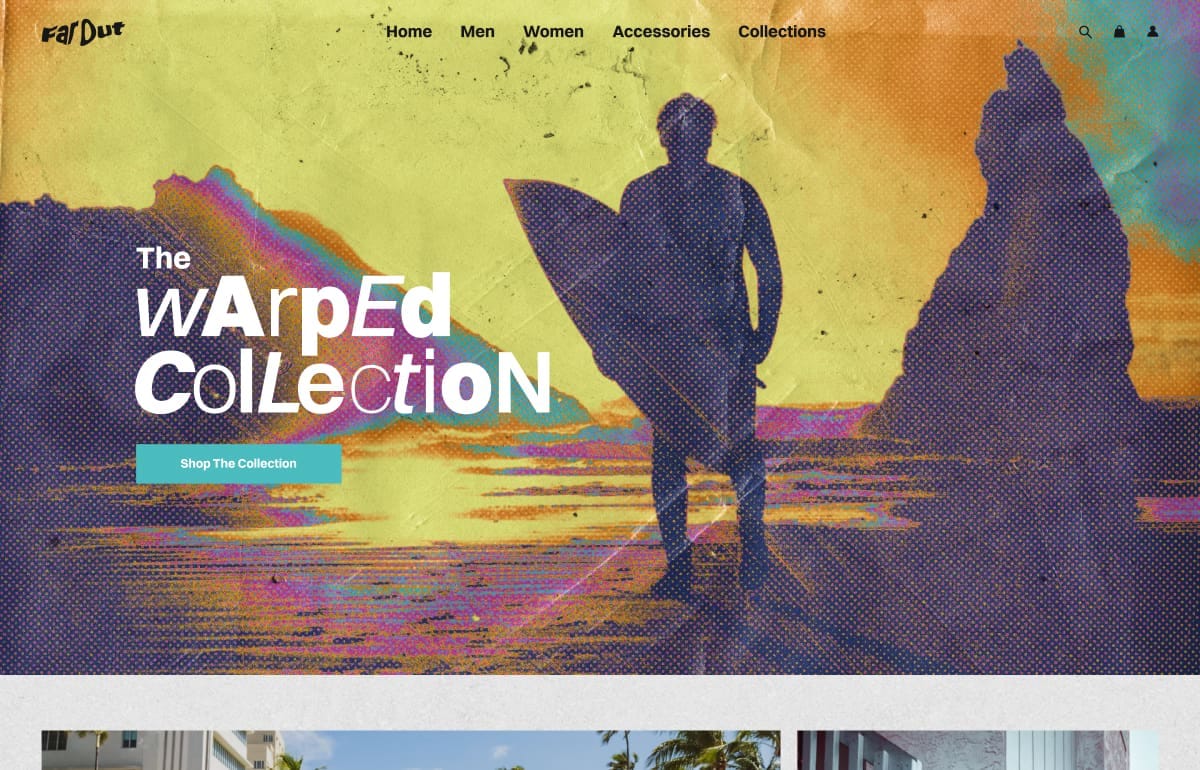
High-quality, lifestyle-oriented photos convey the brand’s appeal. The mosaic layout offers a balanced mix of surf action shots, relaxed lifestyle images, and fashion photography.
Layout
The structured grid layout ensures easy navigation and a smooth browsing experience. The Men’s and Women’s Lookbooks are cleanly organized, providing quick access to product collections.
User Experience
Storytelling can transform a standard product page into an immersive experience.
Consistent imagery and thoughtful editing can significantly elevate brand perception.
This project reinforced my passion for blending design with narrative to create memorable digital experiences.
Consistent imagery and thoughtful editing can significantly elevate brand perception.
This project reinforced my passion for blending design with narrative to create memorable digital experiences.
_bnb0s9GzTeDjkbjfWg1VZ.jpg?width=3840&quality=80&format=auto)
Conclusion
The "Far Out" landing page effectively combines bold design elements with strategic storytelling. It aligns with the surf culture's adventurous spirit and provides a seamless experience for potential customers. The overall design reinforces the brand identity while delivering a visually compelling and user-friendly interface.